Thinking
Ideveloper's

ideveloper
May 20, 2019 - 9 min read
Thinking about emotion js vs styled component
새롭게 프로젝트를 설계 하기 위해 요새 많은 개발자들이 사용하고 있는 css-in-js 스타일링 방식인 emotion.js 그리고 styled component에 대해 파악하기 위해 여러가지를 조사하여 보았습니다.
emotion vs styled component
비교 관련 글 : https://github.com/jsjoeio/styled-components-vs-emotion
trends
npm trends: https://www.npmtrends.com/@emotion/core-vs-styled-components

크기
크기면에서는 emotion이 더 작았습니다.
styled-component : 15.8kb https://bundlephobia.com/result?p=styled-components@4.2.0

@emotion/core: 6.4kb https://bundlephobia.com/result?p=@emotion/core@10.0.10

emotion.js와 styled component 비교 예제
두 라이브러리를 적용해 보기 위해 간단한 count app에 emotion과 styled component를 적용하며 비교해보았습니다.
같은 마크업에 emotion과 styled component를 적용하여 비교해 보았습니다. 한눈에 차이점을 파악하기 쉬울것입니다.
깃헙 : https://github.com/Brew-Brew/react-hook-playground/tree/master/hook-count-style
우선,
- 협업관점
- 개발관점
이 두가지 관점에서 적용에 대해 생각해 보았습니다.
협업관점에서 고려하려 했던점은 이전에 scss, css module 을 활용할때에는 디자인 팀과 함께 디자인 qa 시에 코드 수정권한을 주어 효율적인 업무를 하고 있었기에, 기존의 이 업무방식을 유지하면서 css-in-js 라이브러리를 활용할 방법에 대해서 생각해 보기로 했기 때문입니다.
일단 이렇게 할때 우선시 되어야 할점은 css 관련 코드의 관심사 분리였습니다.
기존 방식은 css 코드를 분리하여 그 css 파일을 import 하는 방식이었기 때문에 기존 js코드 들을 건드리지 않기 때문에 크게 신경쓰지 않아도 되는 사항이었습니다.
emotion.js 와 styled component 모두 css 관련한 js 코드들을 따로 모아놓고 import하면 되었기에 관심사 분리는 가능했었습니다.
또한 협업시에 Chrome dev tool로 classname으로 서로 디자인 qa 커뮤니케이션을 하는데 css in js 방식은 따로 prefix같은것을 붙히지 않아 어려움이 있지않을까 생각했었는데 각자의 라이브러리에서 그 해결방안을 제시하고 있었습니다.
개발관점에서는 js 기반의 syntax안에 css 코드가 들어가므로 개발자 경험 관점에서는 매우 유연한 코드 및 효율적인 코드 작성이 가능했습니다.
또한 emotion 및 styled component에서 제공하는 여러 feature들이 scss가 제공하던 기능 (mixin, nested) 그 이상을 제공하여 매우 편리하였습니다. 또한 ssr 지원이나 cache 지원등등 개발관점에서는 이점이 있는것은 확연히 알 수 있었습니다.
협업관점
css 관련 코드의 관심사 분리
두 라이브러리 모두 css-in-js 방식이므로 결국엔 js syntax안에 css 코드가 들어가는 것이므로 관심사를 분리하는것은 간단했습니다. css 관련 js 파일이 기존 주요 로직에 영향을 끼치면 안되므로 css 관련 js코드는 분리하여 보관했습니다.
- emotion 방식
// css/WithEmotionComponent.js
import { css } from '@emotion/core';

...

const blackButton = css`
  ${button}
  label: black-button;
  background-color: black;
  color: white;
`

export {
  wrapperClass,
  imgClass,
  titleClass,
  whiteButton,
  blackButton
}

// WithEmotion.js

/** @jsx jsx */

import React, { useState } from 'react';
import { jsx } from '@emotion/core';
import { wrapperClass, imgClass, titleClass, whiteButton, blackButton } from './css/WithEmotionComponent';
function App() {
  const [ count , setCount ] = useState(0);

  const addCount = () => setCount(count + 1);
  const subCount = () => setCount(count - 1);

  return (
    <div css={
      wrapperClass
    }>
      <h1 color="white" css={titleClass}>With emotion</h1>
      <p>MINIFIED :17.2kB</p>
      <p>MINIFIED + GZIPPED : 6.4kB</p>
      <img css={imgClass} src="https://cdn-images-1.medium.com/max/1600/1*gGzRmUKNOC_X7klFjTk8EA.png" />
      <p>{count}</p>
      <button css={[blackButton, whiteButton]} onClick={addCount}>+</button>
      <button css={[whiteButton, blackButton]} onClick={subCount}>-</button>
    </div>
  );
}

export default App;- styled-component 방식
// css/WithStyledComponent.js
import styled from 'styled-components';
...
const ImgClass = styled.img`
width:40px;
height: 40px;
`
export {
WrapperClass,
TitleClass,
WhiteButton,
BlackButton,
ImgClass
}
// WithStyledComponent.js
import React, {useState} from 'react';
import { WrapperClass, TitleClass, ImgClass, WhiteButton, BlackButton} from './css/WithStyledComponent';
function App() {
const [ count , setCount ] = useState(0);
const addCount = () => setCount(count + 1);
const subCount = () => setCount(count - 1);
return (
<WrapperClass>
<TitleClass>With styled component</TitleClass>
<p>MINIFIED : 43.3kB</p>
<p>MINIFIED + GZIPPED : 15.8kB</p>
<ImgClass src="https://cdn-images-1.medium.com/max/1600/1*p1TndLk3UsGPBsM7qHPZIw.png"/>
<p>{count}</p>
<WhiteButton onClick={addCount}>+</WhiteButton>
<BlackButton onClick={subCount}>-</BlackButton>
</WrapperClass>
);
}
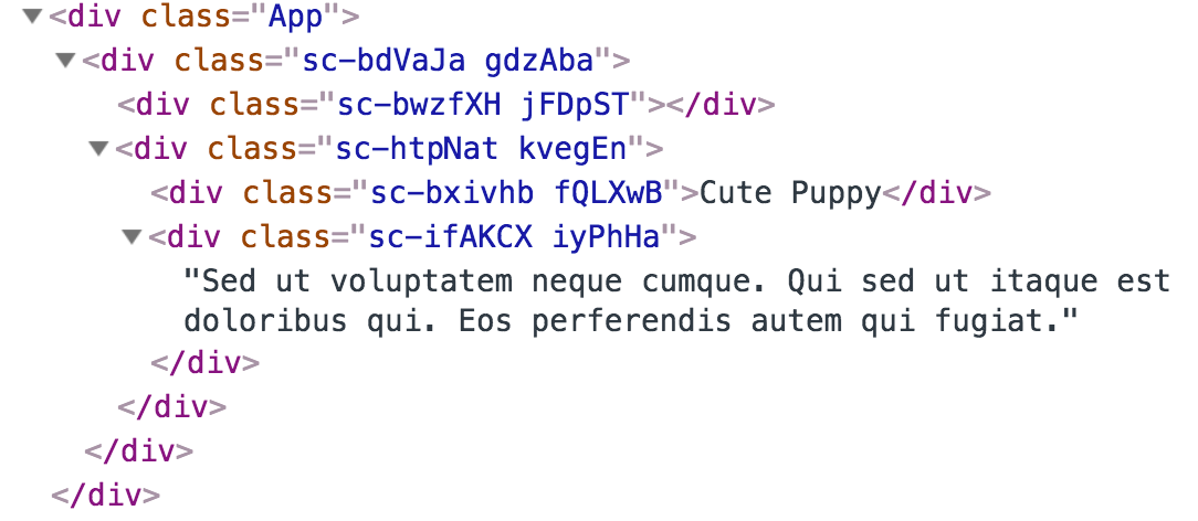
export default App;디버깅 (디자인 qa)
css in js 관련 라이브러리들은 class name에 자동으로 hash를 붙여줌으로써 css code를 겹치지 않게 해주었습니다. 그러나 아래와 같은 class name은 디자이너와 협업시에 좋지 못한 협업 경험을 주게 됩니다.
emotion.js (labeling, babel plugin emotion - labelformat )
#####1.labeling
emotion.js에서는 라벨링 방식으로 디버깅을 할수 있게 기능을 제공하고 있었습니다. hash 방식으로 class name을 자동으로 할당해 주어 css 가 겹치는 이슈는 해결하고, 디자이너와의 디자인 qa시 커뮤니케이션을 위한 문제도 해결이 된 것입니다.
참고링크 : https://emotion.sh/docs/labels

#####2.babel - plugin - emotion (label format)
링크 : https://emotion.sh/docs/babel-plugin-emotion#labelformat
위의 라벨링 방식은 자동으로 뒤에 특정 label을 붙여 주지만, 컴포넌트의 이름이나 코드의 위치와는 상관없는 label이 붙으므로, 자동으로 이와 관련한 이름이 할당되는것이 좋을 것입니다.
이를 babel plugin emotion이라는 바벨 플러그인의 label-format 옵션을 활용하면 해결할 수 있습니다.
링크를 들어가면 알수 있지만, 아래 3가지의 property로 할당되는 class name을 지정해 줄수 있습니다.
[local] - the name of the variable the result of the css or styled expression is assigned to.

[filename] - name of the file (without extension) where css or styled expression is located.

[dirname] - name of the directory containing the file where css or styled expression is located.
따라서 .babelrc 파일에서 아래와 같이 autoLabel을 true로 지정해주고, "labelFormat" 에 알맞은 형식을 넣어 customizing 해주기만 하면 됩니다. 예를들어 [dirname]-[filename]--[local] 와 같은 형태로 넣어주면 (코드의 위치 -- 파일이름 -- 변수명) 의 형태로 classname이 정해지는 것입니다.
위의 labeling 방식은 별도로 설정을 잡아줄게 없어 편리하긴 하지만 매번 label 값을 넣어줘야 하고, 또 별도의 컨벤션이 없는 classname이 만들어 지기 때문에 qa나 협업시에 커뮤니케이션이 좋지 않을수 있으므로, 이 방식이 더 편리할것입니다. :)
"plugins": [
    [
      "emotion",
      {
       "autoLabel": true
       "labelFormat": "[dirname]-[filename]--[local]",
      }
    ]
  ]
styled component (babel plugin)
https://www.styled-components.com/docs/tooling#babel-macro
cra에서는 별도 설정없이 import styled 'styled-components/macro' 과 같은 형태로 import 한것을 바꿔주기만 하면, full-featured option 을 활용하여 디버깅을 할수 있었습니다. 그러면 아래와 같은 prefix가 붙는것을 확인할 수 있었습니다.

개발 관점
ssr에 최적화 된 css-in-js 스타일링 방식
기존 css-module + css loader 방식으로 스타일링을 할시에는 모든 css를 css 파일로 extract 해서 head안의 link 태그로 그 스타일을 참조하는 반면, css-in-js 기반의 스타일링은 dom 상단에 style 태그로 스타일을 입혀줌으로써 ssr에 최적화 된 스타일링을 사용할 수 있습니다.
아래 캡쳐된 사진을 보면 알 수 있듯 style 관련 코드들을 서버에서 바로 받아 올수 있게됩니다.

또한, next.js를 활용할 때에는 코드 스플리팅도 default로 지원하니 필요한 스타일만 불러옴으로써 ssr에 더 최적화 된 스타일링 방식일것입니다.
https://www.infoq.com/news/2019/04/emotion-10-css-prop-styling
If you’re using the new css prop or styled, you don’t need to do anything other than calling React’s renderToString (or renderToNodeStream). This is especially exciting for component libraries because consumers don’t need to do anything special to use a component.
You can now publish a React component to NPM with styles, and it will just work with server-side rendering without requiring consumers to do anything.
위 링크에서 발췌한 글에서 도 알 수 있듯 별도의 설정 없이 ssr에 최적화 된 스타일링을 적용할 수 있습니다.
emotion.js

링크: https://emotion.sh/docs/introduction
적용해보며 여러 장점이 있었지만, 그중 주요한 feature들만 위 예제를 예시로 들어 소개하겠습니다.
우선 emotion js에 css prop을 적용하는 방식은 2가지 가 존재합니다. 그중, 저는 react 기반으로 개발을 하고 있으므로 두번째를 택했고, object 방식(https://emotion.sh/docs/object-styles), 그리고 css template literal 중 디자인 팀과 협업시에 더 명확한 코드를 보여줄수 있는 css templae literal을 사용하였습니다.
- Frame work agnostic( 프레임워크와 관련 없이 사용할때)
- React => @emotion/core
- Object 방식
- Css template literal (선호) css syntax를 그대로 사용하므로 협업 할때 편리할듯
composition
참고하면 좋은 링크 : https://emotion.sh/docs/composition
composition은 우선 스타일들을 함께 매우 쉽게 합칠수 있게 해주는 기능입니다.
기존 css 기반은 선언 순서대로 적용되어 클래스명을 어떠한 순서로 쓰는지는 관련이 없었어서 큰 오류들을 많이 스타일링할때 만들곤 하며, 또한 !important 를 남용하기도 했었습니다.
ex) https://emotion.sh/docs/composition 예제 참고 (-danger 가 적용될것으로 예상되지만 선언 순서대로 적용되어 base가 적용됨)

따라서 emotion.js에서는 composition을 활용해 아래와 같이 의도대로 코드를 작동시킬수 있게 되었습니다. :)

위 예제에서 해당하는 부분은 아래 코드입니다.
<button css="{[blackButton," whiteButton]} onClick="{addCount}">+</button>
<button css="{[whiteButton," blackButton]} onClick="{subCount}">-</button>
const button = css`
border: 2px solid black;
font-size: 20px;
`;
const whiteButton = css`
${button}
label: white-button;
background-color: white;
color: black;
`;
const blackButton = css`
${button}
label: black-button;
background-color: black;
color: white;
`;prop 기반으로 한 조건부 스타일링
기존 css module + classNames 를 활용하였을때는 특정 prop에 따라 클래스들을 다르게 적용하는 방식으로 경우에 따라 만들어야 하므로 클래스들이 산발적으로 늘어나는 문제가 있었습니다. 따라서 prop에 따라 같은 클래스내에서 특정 attribute만 변경해주면 되므로 이러한 문제가 해결 되었습니다.
/** @jsx jsx */
import React, { useState } from "react";
import { jsx } from "@emotion/core";
import {
wrapperClass,
imgClass,
titleClass,
whiteButton,
blackButton,
} from "./css/WithEmotionComponent";
function App() {
const [count, setCount] = useState(0);
const addCount = () => setCount(count + 1);
const subCount = () => setCount(count - 1);
return (
<div css={wrapperClass}>
<h1 color="white" css={titleClass}>
With emotion
</h1>
<p>MINIFIED :17.2kB</p>
<p>MINIFIED + GZIPPED : 6.4kB</p>
<img
css={imgClass}
src="https://cdn-images-1.medium.com/max/1600/1*gGzRmUKNOC_X7klFjTk8EA.png"
/>
<p>{count}</p>
<button css={[blackButton, whiteButton]} onClick={addCount}>
+
</button>
<button css={[whiteButton, blackButton]} onClick={subCount}>
-
</button>
</div>
);
}
export default App;아래 사진에서 알 수 있듯이 h1 태그에 css prop을 넘겼고, EmotionCssPropInternal 이라는 태그로 wrapping 태그 그안에 prop으로 color가 들어가 있는 것이 보입니다. 따라서 이를 css template literal에서 활용할수 있게 되는것입니다.

const titleClass = (props) => css`
label: title;
font-size: 30px;
color: ${props.color} ${[media[0]]} {
font-size: 40px;
}
${[media[1]]} {
font-size: 50px;
}
${[media[2]]} {
font-size: 60px;
}
`;mixin과 같이 활용할수 있는 feature
css in js의 장점중 하나인것 같습니다. js 기반이기 때문에 아래와 같이 자유로운 css extend가 이전의 scss의 mixin 처럼 가능합니다.
const button = css`
  border: 2px solid black;
  font-size: 20px;
`;

const whiteButton = css`
  ${button}
  label: white-button;
  background-color: white;
  color: black;
`;

const blackButton = css`
  ${button}
  label: black-button;
  background-color: black;
  color: white;
`;media query
1.별도의 media query function 만들기
아래와 같은 별도의 media query function을 만들어 활용 할수 있었습니다. include-media 라이브러리를 활용은 못했지만 js 기반의 syntax를 css에 적용할수 있기 때문에 비슷하게 function을 추후에 만들수 있겠다는 생각이 들었습니다.
const breakpoints = [320,768,1024,1440];

const media = breakpoints.map(
  bp => `@media (min-width: ${bp}px)`
)

const titleClass = (props) => css`
  label: title;
  font-size: 30px;
  color: ${props.color}
  ${[media[0]]} {
    font-size: 40px;
  }
  ${[media[1]]} {
    font-size: 50px;
  }
  ${[media[2]]} {
    font-size: 60px;
}2.css-in-js-media npm 활용하기
link : https://github.com/Brew-Brew/css-in-js-media
위 npm을 활용하면 css-in-js (styled-components, emotion.js) 스타일링 라이브러리에서 쉽게 미디어 쿼리를 이용해 반응형을 대응할수 있는데요, 기존 scss기반에서 활용했던 include-media와 비슷하게 이용이 가능합니다.
아래의 break-point 를 참고하여 원하는 viewport에 해당하는 구간을 명시해 줘서, 쉽게 반응형 대응이 가능합니다 :)
smallPhone: 320
phone: 375
tablet: 768
desktop: 1024
largeDesktop: 1440
import media from "css-in-js-media";
export const exampleClass = css`
color: red;
${media(">desktop")} {
font-size: 15px;
}
${media("<=desktop", ">tablet")} {
font-size: 20px;
}
${media("<=tablet", ">phone")} {
font-size: 25px;
}
${media("<=phone")} {
font-size: 30px;
}
`;styled-component
다음은 styled-component에 대한 소개입니다.
링크 : https://www.styled-components.com/docs

prop 기반으로 한 조건부 스타일링
styled component 역시 prop을 기반으로 한 동적인 조건부 스타일링이 가능했습니다.
const TitleClass = styled.h1`
font-size: 30px;
color: ${(props) => props.color} ${[media[0]]} {
font-size: 40px;
}
${[media[1]]} {
font-size: 50px;
}
${[media[2]]} {
font-size: 60px;
}
`;mixin 처럼 extend
styled component는 아래와 같이 mixin 처럼 extend가 가능했습니다.
//아래와 같이 mixin 처럼 사용 가능
const Button = styled.button`
border: 2px solid black;
font-size: 20px;
`;
const WhiteButton = styled(Button)`
background-color: white;
color: black;
`;
const BlackButton = styled(Button)`
background-color: black;
color: white;media query
1.styled component 역시 아래와 같이 function으로 활용이 가능했습니다.
const breakpoints = [320, 768, 1024, 1440];
const media = breakpoints.map((bp) => `@media (min-width: ${bp}px)`);
const TitleClass = styled.h1`
font-size: 30px;
color: ${(props) => props.color} ${[media[0]]} {
font-size: 40px;
}
${[media[1]]} {
font-size: 50px;
}
${[media[2]]} {
font-size: 60px;
}
`;2.위에서 말한 css-in-js-media npm 역시 쉽게 적용이 가능합니다.
import media from "css-in-js-media";

export const exampleClass = css`
  color: red;
  ${media(">desktop")} {
    font-size: 15px;
  }
  ${media("<=desktop", ">tablet")} {
    font-size: 20px;
  }
  ${media("<=tablet", ">phone")} {
    font-size: 25px;
  }
  ${media("<=phone")} {
    font-size: 30px;
  }
`;마치며
css in js 라이브러리를 도입하면 기존 스크립트에 영향이 커지고 해쉬방식이라 디버깅이 쉽지 않지 않아 협업이 쉽지 않지 않을까 하는 생각이 초기에 들었었는데, css 관련 코드의 관심사 분리와 디버깅을 해결하는 여러 방안들이 있다는 것을 알게되었고 또 이로인해 협업관점에서의 문제점이 해결됨과 동시에 css-in-js의 여러 feature들을 활용하면 디자인 팀과의 디자인 qa 에서 얻는 협업 관점의 이점과 css-in-js 라이브러리 (새로운 방식의 스타일링 방식)에서 제공되는 여러 기능들로써 얻는 개발 관점의 이점을 모두 얻을 수 있겠다는 생각이 들었습니다. 모든 기능들을 다 파악해 보진 못했지만 정말 많은 기능을 제공하여 개발자관점에서 정말 큰 이점을 제공하여 생산성에 큰 도움이 될거란 생각이 들었습니다. 또한 next.js로 ssr을 지원하게 될것 같은데 서버사이드 렌더링에도 css in js방식을 공홈에서도 추천해주고 있어 더 큰 확신이 들기도 했습니다. https://nextjs.org/learn/basics/styling-components
Consequently, there are a bunch of practical issues to consider
with traditional CSS-file-based styling (especially with SSR),
so we suggest avoiding this method when styling for Next.js.
같이 보면 좋을 링크들
- https://css-tricks.com/the-fragmented-but-evolving-state-of-css-in-js/
- https://css-tricks.com/bridging-the-gap-between-css-and-javascript-css-in-js/
- https://blog.bitsrc.io/5-ways-to-style-react-components-in-2019-30f1ccc2b5b
- https://medium.freecodecamp.org/learn-emotionjs-during-your-morning-coffee-its-that-easy-2bc60213aca7